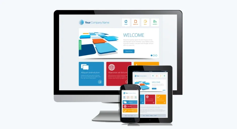
In the highly competitive business landscape of today, the success of a product or service is determined by the level of customer satisfaction it provides. And the factors that lead to customer satisfaction for a product or service include ease-of-use, features and functionalities, responsiveness across digital devices and channels or touchpoints, the accuracy and consistency of its outcome, and cost-effectiveness. If you happen to be an entrepreneur seeking to build a responsive and user-friendly website, then Bootstrap 5 technology is the one to use. According to W3Techs, Bootstrap commands a healthy 25.9 percent of all websites using the known JavaScript library. Also, it covers 78.9 percent of all websites with known CSS frameworks. So, why do developers prefer Bootstrap 5? Let us find out in the below-mentioned segment.
Why Use Bootstrap to Build Websites?
Bootstrap happens to be a popular open-source front-end web development framework that is used to build responsive and user-friendly websites. Presently, Bootstrap 5 is the latest version of the framework, which offers a plethora of features and functionalities to create stunning and highly functional websites. So, how do you go about creating a responsive and user-friendly website using Bootstrap 5? Continue reading the following segment.
Plan your website
At the outset, it’s important to have a clear understanding of the purpose and goals of your website. Besides, you should have a good idea of the target audience and the type of content you want to include on your site. Based on your understanding, choose a suitable technology, say Bootstrap 5.
Download Bootstrap 5
The first step in going about the whole process of website development is to have the Bootstrap 5 software solution on your computer or in the cloud. And to do the same, you can either download the compiled CSS and JavaScript files or use the NPM package manager to install Bootstrap. Once downloaded, you can start using it in your HTML code.
Use a responsive grid system
Bootstrap 5 technology comes with a responsive grid system that enables you to create a layout that adapts to different screen sizes. Further, the grid system is based on a 12-column layout, and you can use the classes provided by Bootstrap to define how many columns each element should occupy.
Use Bootstrap components
The technology has a wide range of pre-built components that you can use to create your website. The components include buttons, forms, navigation menus, modals, and many more. Also, to use a component, you can simply add the corresponding class to your HTML element.
Customize your website
While Bootstrap provides a wide range of pre-built components and styles, you may need to customize your website to give it a unique look and feel. You can do this by creating your own CSS styles and ignoring or overriding the default Bootstrap styles.
To do so, you may create a new CSS file and add your styles. Thereafter, you can link the file to your HTML code using the link tag.
Test your website
Before making your website live, it is of utmost importance to test it for bugs, issues, or vulnerabilities. Here, testing would entail checking whether the website performs accurately and consistently across devices, browsers, and operating systems. And to test the website’s responsiveness and compatibility, you may use tools like Google’s Mobile-Friendly Test and BrowserStack.
Conclusion
Responsiveness and user-friendliness are some of the key parameters that your website needs to attract your target customers. This is where Bootstrap 5 comes in as an excellent tool, thanks to its responsive grid system, pre-built components, and customization options. With these features, you can create a stunning website that performs seamlessly on different devices, browsers, and operating systems. Visit the Knovial website, call (phone number), or send an email to (email ID) to create a business website with rich features, high responsiveness, user-friendliness, and security to reach out to your target customers.


